HYVE group: website redesign.
Important things why the old design didn't work and what was implemented in a new design:
PC version:
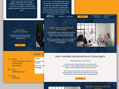
1) The first screen that visitors see influences on their decision to stay on the website or to leave it, so the main info should be shown clearly on the first screen and visitors can easily contact the website owner at any moment without scrolling down.
On this website design I’ve created the header (with all necessary info) which should be dynamic (It will also be attached to the top even when a user scrolls)
There is the information about the company on the first screen which is right because the current website doesn’t give any information about what this website is for and what the company is doing.
2) The block “WE CAN HELP WITH” now is hiding/showing info but, the main info should be visible all the time, because it’s important information
3) The contact information which is at the bottom of the page is on the bright background to attract more attention to contact info and the form.
All the colours are taken from the current website (the main style is saved)
The floating arrow (back to top) should be always visible and not only when you at the bottom of the page, so I made it in the right corner.
Mobile version:
1) In current mobile version there are the same mistakes: no info about the company on the first screen, the menu is hidden and to contact the owner takes 2 clicks (to open the menu, to click on the contact form), in my version it take 1 click to get to the contact form. It makes the conversion action easier for clients.
2) The block “WE CAN HELP WITH” takes up a lot of space, moreover the name of this block now is under the content which is not right according to logical location of information.