Redesign Moko Donuts Logo
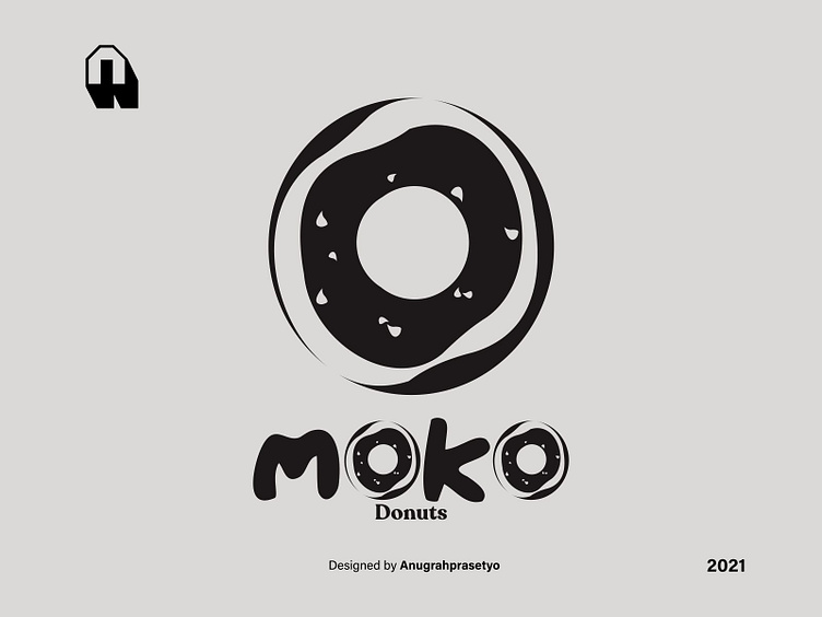
This logo is just a redesign I made for one of the snack products. This logo consists of typography and round shapes like the definition of a donut shape. In working on this logo I mostly use trim and intersect techniques in objects. with this I can complete the redesign of the Moko Donuts logo.