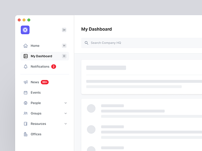
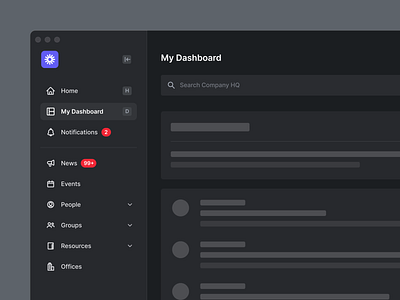
Haystack - Dashboard Navigation
Hi all ✌🏼
Sharing a first glimpse of the Haystack dashboard navigation structure.
A lot of time went into creating the navigation behaviour - the goal was to get the user to their destination as quickly as possible. The faster users find what they are looking for, the more time there is for the user's actual task. We evaluated different menu layouts based on several criteria categories - this allowed us to increase navigation speed to provide the user with the most optimal user experience.
Haystack is today’s modern employee intranet. The software helps companies connect their workforce by streamlining internal communications and forging employee connections.
🧩 Download the Fintory Icon Set
Services we provided: — User Interface design — Interaction design — Motion design — Product design — UX research — Product research — Social Media assets design — Website design — Website development
Do you have a project you’d like to collaborate on? Email us at hello@fintory.com
Want to see more in the future? Don't miss any of our shots and follow us on Dribbble.


