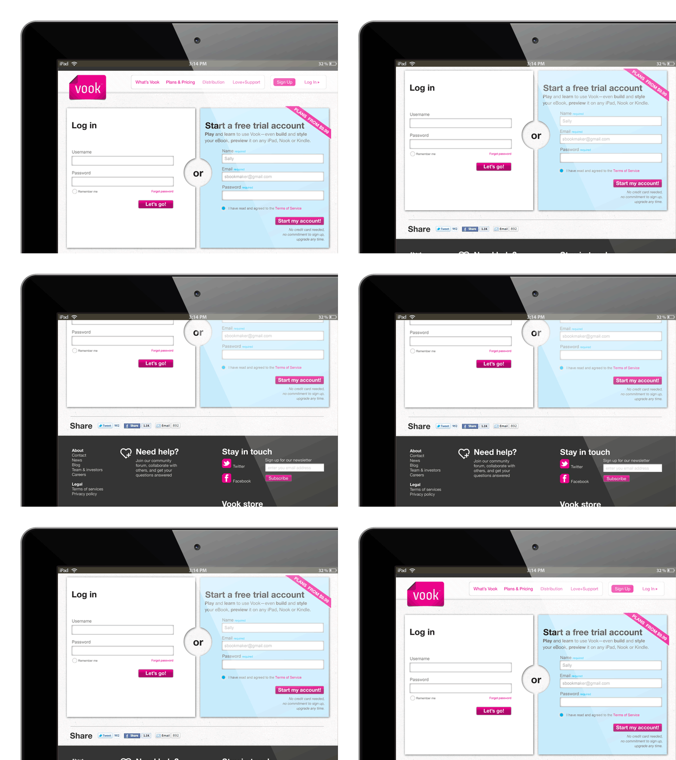
Vook Login
Right after Vook’s public launch, I began using a combination of monitoring Web analytics and user testing to optimize user conversion. One example of the improved signup process is a unified login and signup page—reducing the need to drive users to the correct page. I also worked with engineering to remove as much friction as possible, reducing the signup workflow from a five-step process to a single step.
More by Humanist View profile
Like
