E-Commerce Mobile App
💌 Have a project idea? We are available for new projects info@ronasit.com | Telegram | WhatsApp | Facebook | Linkedin | Website
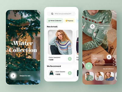
No wonder that sales via mobile apps are rising - online shopping has become a time killer like newsfeed scrolling. A great shopping app is not a mere catalog but gives a user an opportunity to engage and explore. Here's our exploration of a new-type mobile shopping app.
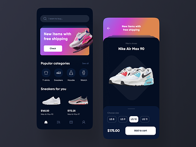
The left screen is a home page with a search bar, special offers, popular categories, and recommended items. The right screen is a special offer page that promotes selected items. The promoted pieces are placed on cards, and one swipes through them to see all offers.
The dark-themed interface follows the established UI trend. The app targets a younger audience, and the dark theme trend suits their expectations of a stylish and eye-friendly interface. We enhanced the user engagement by adding the special offer cards. This type of feature is not very common in shopping apps, and that is what makes our concept stand out.
What cool features have you seen recently in shopping apps?


