Petsmart.com: Website redesign (My vision how it would look bett

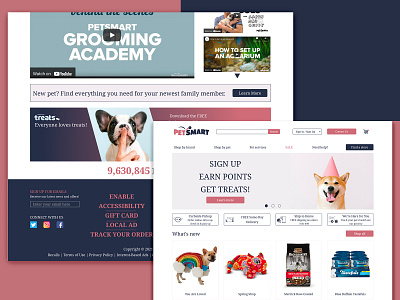
In my opinion the current design has too many too bright colours and it's unclear which information is more important.
The first screen that visitors see influences on their decision to stay on the website or to leave it, so the main info should be shown clearly on the first screen and visitors can easily contact the website owner at any moment without scrolling down (That's why I added the "Contact us" button on the top). Visitors have to be sure that if they have some problems with something, they will easily contact the shop and there is no need to search for contact info hided into the deep of the website.