Educational Attainment Map
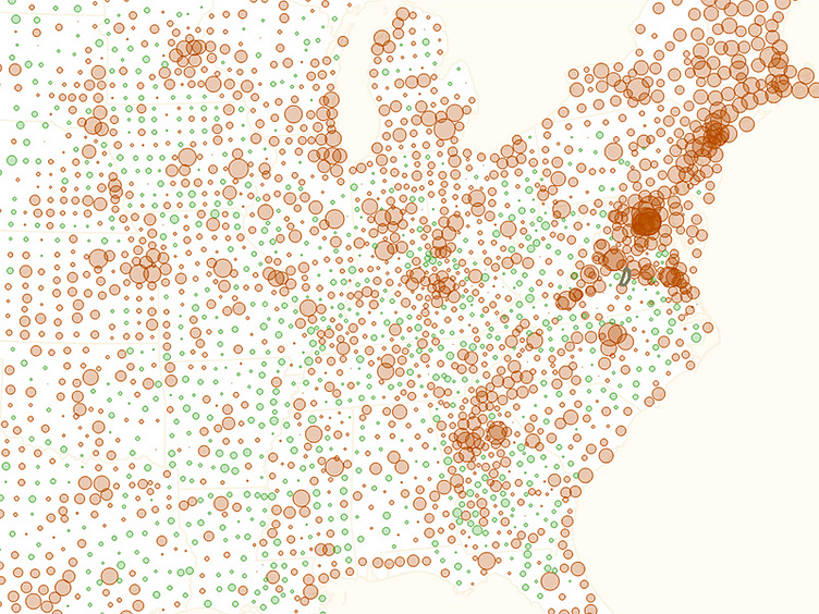
Playing with maps. This map shows the percent of people who have graduate or professional degrees. Green is low, red is high. Still need to do a lot more work, but I liked the data density of the chart.
Playing with maps. This map shows the percent of people who have graduate or professional degrees. Green is low, red is high. Still need to do a lot more work, but I liked the data density of the chart.