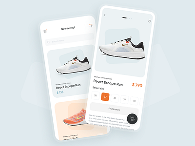
Sneakers store UI concept
Hey-hey, guys! We’re happy to share with you the design we made for the Sneakers store app. It’s literally the app for buying new sneakers! 🛒
👟On the main screen there are new items and fresh arrivals. And there is a menu and filters. On the second screen — card of the shoes themself. You can look through the photos, look at the available sizes, check the product description. After it you can find the product in an offline store.
Pay attention to a basket that jumps very funny when you throw the goods into it! Ha-ha 😋
🔸The color scheme is muted with small orange accents. This is done in order not to violate the minimalistic style of the app.
🛍Cards matching the color of shoes quickly attract the attention of the buyer, and the product screens are clear and intuitive.
Press L if you like our design and share feedback!
