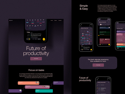
Task Manager App Landing Page
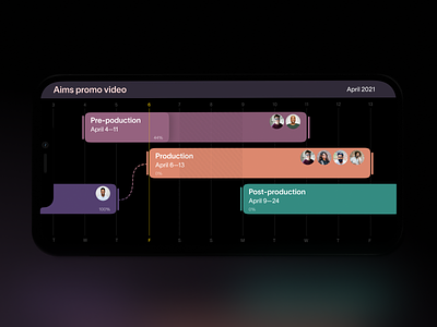
When we try to organize a diversity of things to do, task manager apps become a great help. Take another glance at the design for one of them. In this application, users can create multiple calendars, plan tasks and enjoy a simple aesthetic interface. Color marking helps to quickly monitor tasks from different calendars, while the dark theme supports the good balance of contrast to make text and bright color accents deep, scannable, and avoiding eye strain in any environment of usage. Here you can check the landing page designed to promote the application. Stay tuned to see more!
Also, welcome to read more about types of images in web interfaces and goals behind using photos in UI design, learn how to reach design consistency, and review the guide into basic types of web pages.

