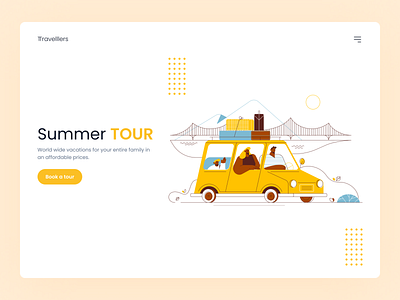
Summer Tour Concept
Sooper-dooper minimal landing page UI design.
In this shot, I tried to be as simple as possible. Here I just used a random logo, menu button, great illustration, some dotted lines, heading, paragraph & A button.
Just these 7 things make this shot clean & minimal.
but what you guys think about it? let me know by putting your thoughts in the comments section below. Or simply like it so I'll understand!
Ohh forgot to tell you that, I'm available for freelance projects! you can contact me here: faiz@chitranu.com
More by Faiz 🍉 View profile
Like
