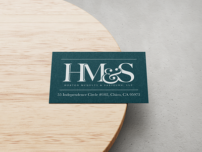
Horton McNulty & Saeteurn, LLP Branding
The client was open to ideas, their only requirement was to have the full name incorporated in the logo somehow. Being such a long name, I made the main focus of the logo their initials and placed their full title underneath. I modified an elegant serifed font and added flair to the ampersand. In this way, the letters are separate but connected. It is clean and corporate with a little personality.
More by Kelly Carey View profile
Like
