radnyk.ua — Two Entry Paths for the Users
Two Entry Paths for the Users
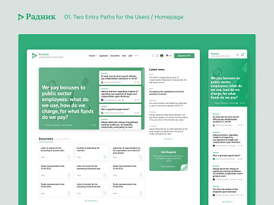
When it came to the page structure, we clearly understood that the website would be used, mostly on weekdays, with the visit frequency at once or twice a week. Our users have two basic jobs to be done — to monitor changes and current industry news, or to seek help in solving a specific work problem.
Most users start their visit from the home page: on the first screen, we offer the selection of the most relevant articles of the week, which usually reveal all of the important changes and instructions on how they might affect accounting workflows.
On the right side of the screen, we display a selection of the latest news for today, so that even everyday users find something interesting for them to read.
Below the first screen, we show the new legislation, orders, and other regulations, along with the latest document templates — this is the section for the users that like to get acquainted with the relevant changes directly from the source, omitting the point of view of the editors.
The structure and navigation of the website seem clear to users. But those who visit with a goal to solve a particular problem usually turn to search. We implemented the search in two formats — the quick way with a simple feed of the relevant results, and the advanced way, where users can filter the search results by sections, topics, and dates.
Special kudos to Eugene Klochkov who did great on the UI side of this project.


