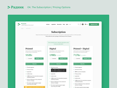
radnyk.ua — The Subscription
Simple Subscription Flow
The business set a simple and obvious task for the online magazine website — to sell as many subscriptions as possible. We weren’t able to help them with the sales, so the best my team could’ve done is to design a simple, clear, and easy-to-use subscription flow.
The subscription funnel is straightforward. At first, a guest visitor sees appropriate and non-annoying calls to create an account which would allow them to preview a limited portion of paid content. After that, converted users would start seeing paywalls with calls to subscribe, which lead them to the subscription page.
We disclose the difference between pricing options and describe the benefits of subscribing with the help of illustrations and answers to frequently asked questions on the subscription page.
The checkout page is extra simple, built as a one-step form, and in some cases, it may consist of only a few inputs to fill.
Subscription status is easily tracked and can be deactivated or renewed in one click, from the user’s profile page.
Special kudos to Eugene Klochkov who did great on the UI side of this project.


