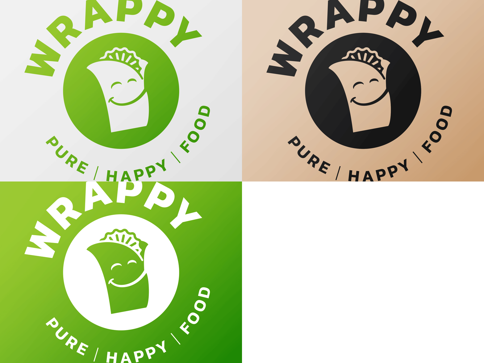
Wrappy 🌯
A logo for a friend's food business first only contained text. She had only a wordmark logo and colors to go with. That wouldn't do it for me. The logo needed to express more happiness, freshness and artisanship.
I wanted to express the name in a logo mark, so I started off with a wrap, naturally. It needed to be a Wrappy wrap, so I had to figure out how to carry the correct emotion so to speak. The wrap's wrappy wrapper was the answer! All done, looking at the logo, I could truly say: "it's a wrap!".
More by Jeroen Rood View profile
Like
