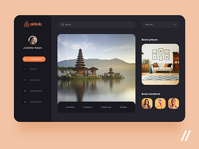
Airbnb Web App Redesign
The team is available for new projects! Drop us a line: hello@purrweb.com | WhatsApp | Website
Hello, Dribbblers!
Check out how we designed a dashboard of an Airbnb-like platform 🏠
🔍The main focus is done on intuitive navigation and the product search.
🔝The user may also see the best offers based on previous searches.
⚫️ 🟠 We took the dark theme together with orange accent color. Such combination allows for concentration and resembles the cozy atmosphere of home 🏡
Press 💜 if you like our design and share feedback!
P.S. If you want to gain insight into UI/UX design trends, check out our article.
Created by Julia Lebedeva
PS We know to utilize UI/UX design to make users fall in love with a product. Check out how we used our skills to:
- raise $400k as capital for startup
- streamline cryptocurrency e-wallet
- reboot a Real Estate startup
- help newbies jump into investing
- conquer the chef freelance market
- simplify the life of event organizers
And that's not all — you can find more case studies in our Blog! 💜


