iStock rebrand
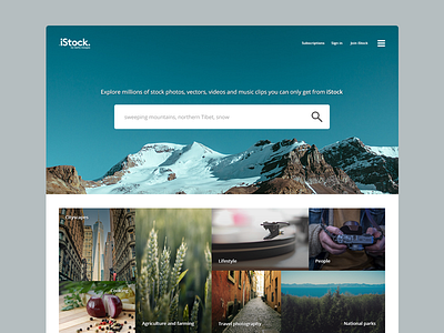
I loved iStock's logo refresh; getting rid of that slightly tacky camera icon was a good move, but they left their website in the same state it was when they first built it in the 80's. So I figured what a stock photography site needs is huge and enticing images... you can find the full project here behance.net/carbonite
