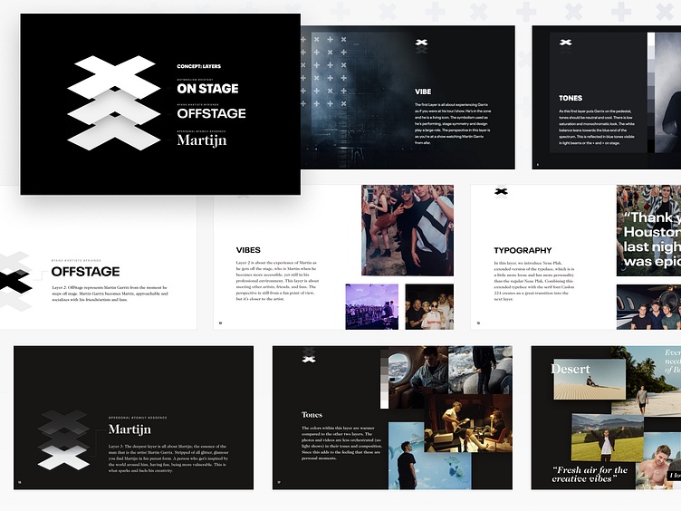
Martin Garrix website concept
An overview of a few slides from the Website Concept we did for the official Martin Garrix website.
Backstory Instead of just diving into Figma after our research (read more in our case study), we wanted there to be more than just a great looking website.
Inspired by Martin Garrix' photography book Life = Crazy, amongst other things, we wanted to play with the idea of allowing the website to show many sides to Martin Garrix. At the same time our research uncovered opportunities for the website and the home page in particular to showcase these sides.
Concept That is how we came up with the concept of Layers where three layers would not only be a metaphor for discovering the sides to Martin Garrix. The concept also entailed visual opportunities to enhance the sense of layering (think; parallax scroll, tweaked styling per layer) etc.
Read more in our case study.
––– Made with the @Yummygum team
