Daily UI #011
C H A L L E N G E
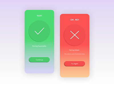
Design a Flash Message with both the outcome for an error and success.
P R O C E S S
I started by sketching out three design options on paper. I also laid out key elements that needed to go into this design: Success message, Fail Message, confirmation of the transaction, CTA to amove on from transaction and to retry the transaction, success = green, red = failed
S O L U T I O N
I ended up combining elements from all three design mockups. Since I knew I wanted to use green and red, I decided to style the flash screens accessibly and also maintain a monochromatic pallet for each. The thing with these is say the foundation colours arent conventionally black or white, it wouldn't stay branding consistent. So these two screens were designed as their own "entities" rather than specific to a brand.
