Cyberworx logo design


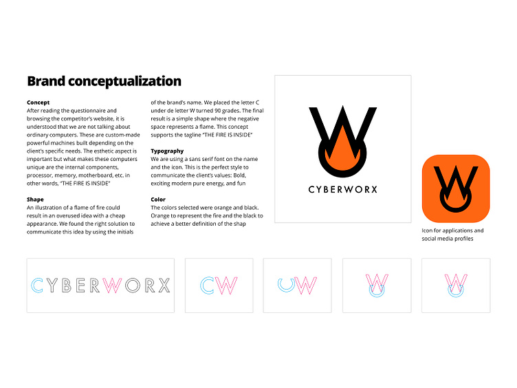


Concept
After reading the questionnaire and browsing the competitor’s website, it is understood that we are not talking about ordinary computers. These are custom-made powerful machines built depending on the client’s specific needs. The esthetic aspect is important but what makes these computers unique are the internal components, processor, memory, motherboard, etc. in other words, “THE FIRE IS INSIDE”
Shape
An illustration of a flame of fire could result in an overused idea with a cheap appearance. We found the right solution to communicate this idea by using the initials of the brand’s name. We placed the letter C under de letter W turned 90 grades. The final result is a simple shape where the negative space represents a flame. This concept supports the tagline “THE FIRE IS INSIDE”
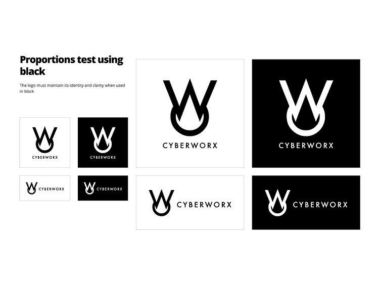
Typography
We are using a sans serif font on the name and the icon. This is the perfect style to communicate the client’s values: Bold, exciting modern pure energy, and fun
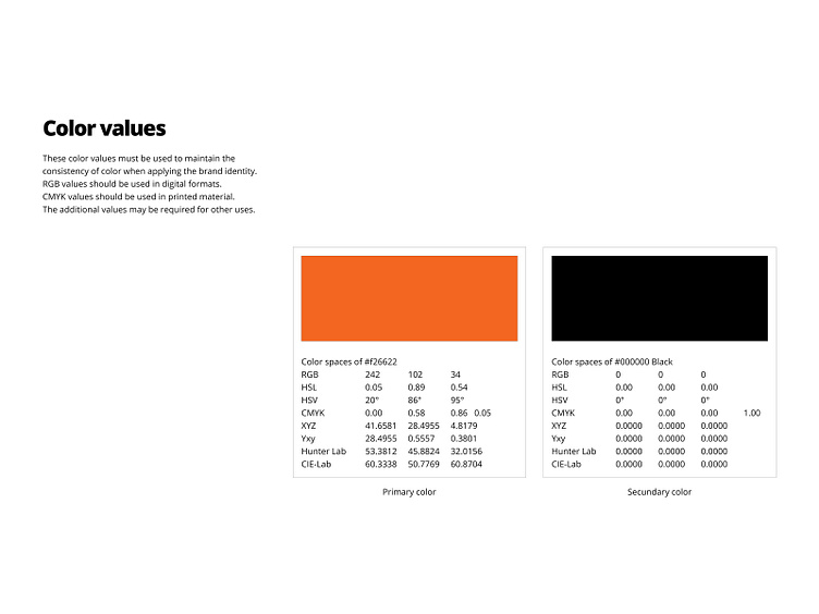
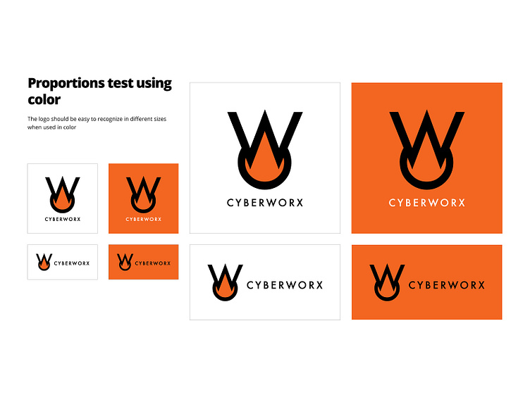
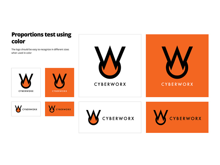
Color
The colors selected were orange and black. Orange to represent the fire and the black to achieve a better definition of the shape
Visit JavierTM.com to view more logos
Concept
After reading the questionnaire and browsing the competitor’s website, it is understood that we are not talking about ordinary computers. These are custom-made powerful machines built depending on the client’s specific needs. The esthetic aspect is important but what makes these computers unique are the internal components, processor, memory, motherboard, etc. in other words, “THE FIRE IS INSIDE”
Shape
An illustration of a flame of fire could result in an overused idea with a cheap appearance. We found the right solution to communicate this idea by using the initials of the brand’s name. We placed the letter C under de letter W turned 90 grades. The final result is a simple shape where the negative space represents a flame. This concept supports the tagline “THE FIRE IS INSIDE”
Typography
We are using a sans serif font on the name and the icon. This is the perfect style to communicate the client’s values: Bold, exciting modern pure energy, and fun
Color
The colors selected were orange and black. Orange to represent the fire and the black to achieve a better definition of the shape
Visit JavierTM.com to view more logos