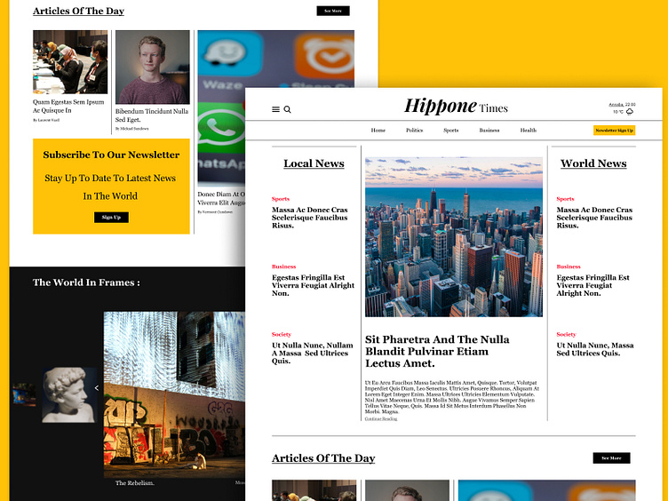
Hippone times newspaper
Hello, dribble fam! this is my proposal for newspaper web design! I wanted to make it clean and clear! and I focused on the UX aspect by adding CTA in almost every section! I add a gallery section because I felt like I want to see more visuals as a user, and last I played with geometry to give an aesthetic feeling to the user and to not feel bored like in every other newspaper, and also without making it complicated for users who seeking news only.
I hope you like it! and I will be glad if you give your feedback!
More by Dia Benatia View profile
Like
