Heathlife I LogoDesign
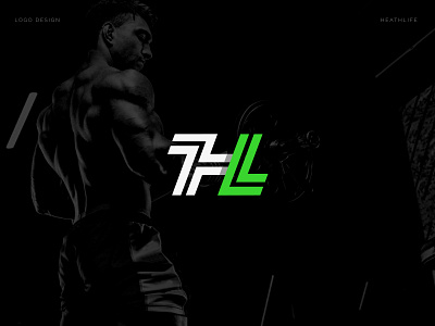


Next I present the design made for HEATHLIFE, a brand associated with the health and physical well-being group. This time a modern and dynamic monogram was designed, created from the initials "H" for Healthy and "L" for Life, from which the brand's name was born.
The isotype is accompanied by the name with a sans serif typeface, sloping and thick stroke, which reinforces the concept of dynamism and is also complemented by the strength and solidity, which the isotype presents and which makes the identifier a fresh, modern proposal. and representative of the sports area.
If you would like the design of a logo / visual identity for your brand, as is, contact me through the email reyjesalexander@gmail.com and I will gladly assist you and help you professionally.
I invite you to see my portfolio:
https://www.instagram.com/reyjesmontero/
Thanks for watching and rating!!