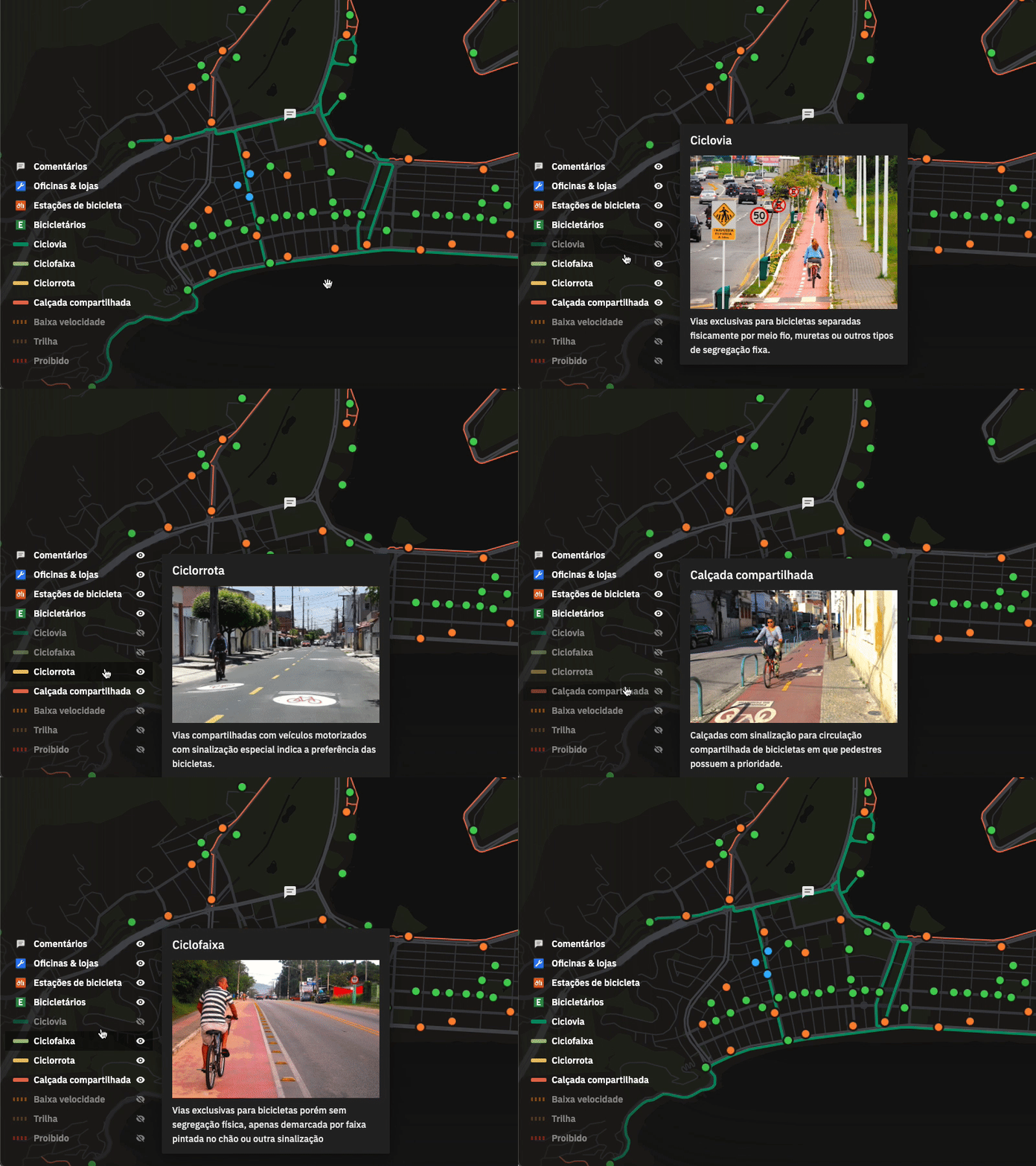
Bike map legend + filters interaction
Maps are quite tricky things to work with. The usual saying about UI being like a joke doesn't really apply to most maps, and you can't really escape from having to explain it.
For CicloMapa I wanted to create a new type of map legend, one that would merge both the informative function, explaining what each symbol and colors mean, but also filtering function, serving as interactive toggles that control the visibility of the layers.
One of the product's main value propositions is standardizing the typology of different cycling infrastructures, simplifying the complex tagging system of OpenStreetMap. We only use simple, common terms, and colors that help you understand which structures are better than others. For example, protected bike lanes are deep green (they're the best <3), while shared sidewalks are red (they put both pedestrians and cyclists in danger :O).
Alongside each description, we included pictures that were handpicked to represent not the perfectly designed bike lanes commonly found in urban planning guides, but the ones that are closer to the reality of our Brazilian cities.
__
I'm a very technical designer & developer looking for improving my visual design chops, so all CC very appreciated!
→ Read the case study: https://cristianodalbem.com/ciclomapa/
→ See it live: https://ciclomapa.org.br
