Bike map POIs (points of interest) design
A promotional social media design I've done for CicloMapa, a web app I designed and built to make bike maps in Brazil more collaborative and accessible.
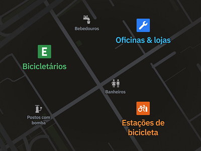
This design, an more "artistic" rendition of UI design, represents one of the main new features we're launching on the map: cycling points of interest!
There are clearly two categories of POIs: the colored ones are the most important, and you can click on them to get more details such as services available at a bike shop, type of structure for bike parking stations, and details about the operator for bike-sharing stations.
The gray ones are not really interactive and have different interpolations functions on how they're rendered. They're just simple pinpoints of places with air pumps available, public restrooms and water fountains.
Icons are mesh-up of Mapbox's Maki icons, Material Design icons and some custom-designed ones, optimized for our custom map style.
__
I'm a very technical designer & developer looking for improving my visual design chops, so all CC very appreciated!
→ Read the case study: https://cristianodalbem.com/ciclomapa/
→ See it live: https://ciclomapa.org.br
