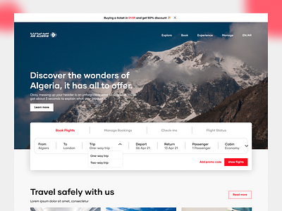
Air Algerie Website Redesign
this is the case study I did with my mentor Nidal Benatia.
the website in the study is Algerian Airlines.
the aspects we took into consideration: UI & UX
we wanted to update the website in terms of the user's interface and we worked on the UX aspect for a better user experience and feeling, and to increase the website's usability and usefulness, in the hero section we focused on promoting Algerian tourism since the company doesn't have flights outer the Algerian borders, we tried to use the brand color moderately because it is red and as known the red is a very strong color, so we used the white color more often for the best UI.
More by Dia Benatia View profile
Like
