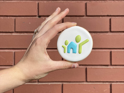
Adoption Support Centre brand
The Adoption Support Centre of Saskatchewan brand - turned cookie! (thanks to the talented @kickyxe) The two figures on either side are intentionally non-nuclear to encompass the many representations of a home. They’re expressed in a bright green, representing a healthy environment for growth and new beginnings. The new unit forged between the two figures is a home, a place of safety and security. A subtle nod to Saskatchewan, the province of operation, is represented in the shape of the angular rectangle doorway.
More by Arcana Creative View profile
Like
