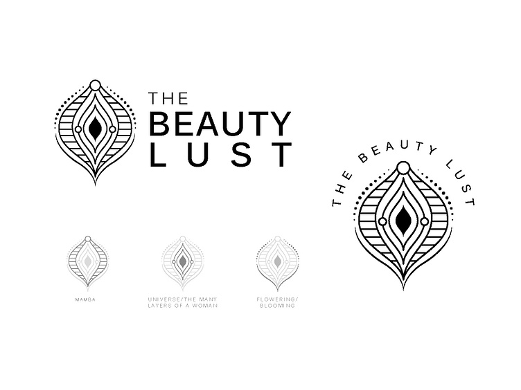
Logo Design Concept for Lingerie
Logo concept for The Beauty Lust
The Beauty lust is a Brazilian Brand of Lingerie & Underwear Store focused on the power of the women.
Their mission is to help strengthen and promote the understanding of Female Sexuality, as well as the specific energy flow of the woman's body.
Pleasure, sexuality and corporeality as a basis for female empowerment and reconnection with natural and intuitive spirituality that each woman brings within her.
They are not just a brand, they want to represent women empowerment, translated into the equal rights that were achieved with great effort by women warriors.
They wanted a logo that resembles the vagina, but not something ordinary, something which is delicate, something that resembles a vagina, but is not too explicit.
LOGO CONCEPT
An abstract vagina. (image 2 on https://www.instagram.com/p/CIqW6uQgw_V/ )
The mamba head at the top represents how women are warriors, just like the mamba when corned(in the society) women can strike back and keep on striking till the moment they don't get what they want (in the case of mamba, till the prey is dead). Fact source : National Geographic.
The universe inside the vagina is to represent that as women, we have a whole another universe inside us, we are not everything we show but a lot more than that.
Floral elements represent the flowering/blooming period a woman experiences every month, which is the desire of being sexual, the desire to be pleased, between their cycle each month.
They really liked the overall concept but asked me to minimalize it, which is displayed on image 3 ( https://www.instagram.com/p/CIqW6uQgw_V/ ). When I minimalized it, I added an additional concept of the many layers a woman has (included it with the universe concept).
The logo is further displayed alongside an image and on a website.
Let me know what you all think.
