EQUINOX cosmetic packaging design
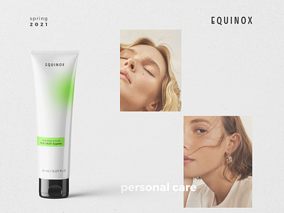
EQUINOX is a new cosmetic brand. They plan to become a thread in the spring of 2021. The brand does not use many ingredients, does not cause allergies. This was asked to be reflected in the packaging design. The minimalistic design and the absence of unnecessary elements should give the buyer the opportunity to feel its simplicity. Since the cosmetics are designed for the target audience following the trends, I decided to use blur in the design. Thus, the entire line of cosmetics maintains a uniform style. Moreover, each product - scrub, cream, serum - has its own color marking. This simple trick will tell the girls which line they are using - for normal, oily or dry skin.
✌🏻 Do you have a project?
Let's work on it together! ✌🏻
