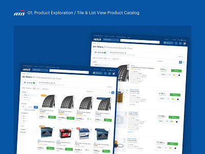
atl.ua — Product Exploration Flow
Best Practices Combined with Focus on Drivers
The main flows of the website were designed based on the analysis of the best modern practices and solutions in the field of e-commerce and automotive interfaces. Though we have never forgotten about the customer — an average car driver out there, on the street.
The client has decided to set off a new business direction and to start selling spare auto parts.
The product catalog pages were built so it is convenient to sell and, of course, to explore very different products — from interior air fresheners to clutch slave cylinders. We also had to keep in mind professional customers, those who will look for multiple spare parts of many different cars.
The technical limitations were also in place, we had to figure out how to adapt a complex structure and flow of two external catalogs — Tecdoc and Laximo.
We’ve also noticed that the user has quite a journey reviewing different products before deciding to add them to the cart. So the solution to simplify their life was to make the product page template as rich with possibilities as possible, offering:
✓ A wide list of information on stocks, shipping, and payment options;
✓ A full list of product characteristics;
✓ A supplementary and substitutionary products section;
✓ A section where users can check whether the product is compatible with one of their cars.
The navigation is the king of a website with 100+ product categories, meaning that we had to deliver a clear, one-step, and easy-to-use desktop catalog menu.
On the other hand, we’ve offered a simplified step-by-step product category navigation on mobile, also highlighting the search input in the header.
I would like to mention my fellow teammates Eugene Klochkov and Vladyslav Dobryda who did great job working on this project.


