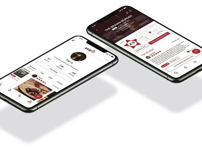
Yelp App Redesign
The problem with the app interface is the overwhelming amount of clutter on every single page within the app. It significantly impacts the user’s experience in a very negative way. It needs to be simplified so that only useful information is available.
I designed the app to be more straightforward and user friendly. There are only four icons in the navigation bar and they all clearly indicate what lies on their respective pages.
SEARCH
When on the search page, there are many tiles that serve as shortcuts for when a user may feel like they have an idea about what service they are looking for, but would appreciate suggestions. Business ratings are very easy to spot and read, along with their hours of operation, address, service type, distance, and price range. The Business page layout has been dramatically shortened, with the most useful information available.
HOT SPOTS
A “Hot Spots” page was added as a way for people to see what businesses in their area are trending. They can adjust what types of businesses they’d like to see. It is essentially a live local feed.
ACTIVITY
To increase sociability within the app, I also assigned an activity feed where you can recieve notifications and updates about interactions with your posts. Here, you will also be able to see what deals and offers businesses from businesses near you.
PROFILE
The layout of the profile page makes it so it easy to spot your name, bio, followers, and posts. Messaging has also been placed here in the top left corner. The messages you recieve can come from other users on the app, as well as businesses when they send updates about a reservation or order.
Throughout the app, business profile images are rounded-squares and user profile images are circular, making them easy to discern from one another.


