Team Imara
Logo design for Team Imara.
Team Imara's branding project kept my hopes up during the early days of the covid-19 lockdown.
2020, Cara Alexander, Imara Team Imara, @createcaptivate, Branding & Logo Design.
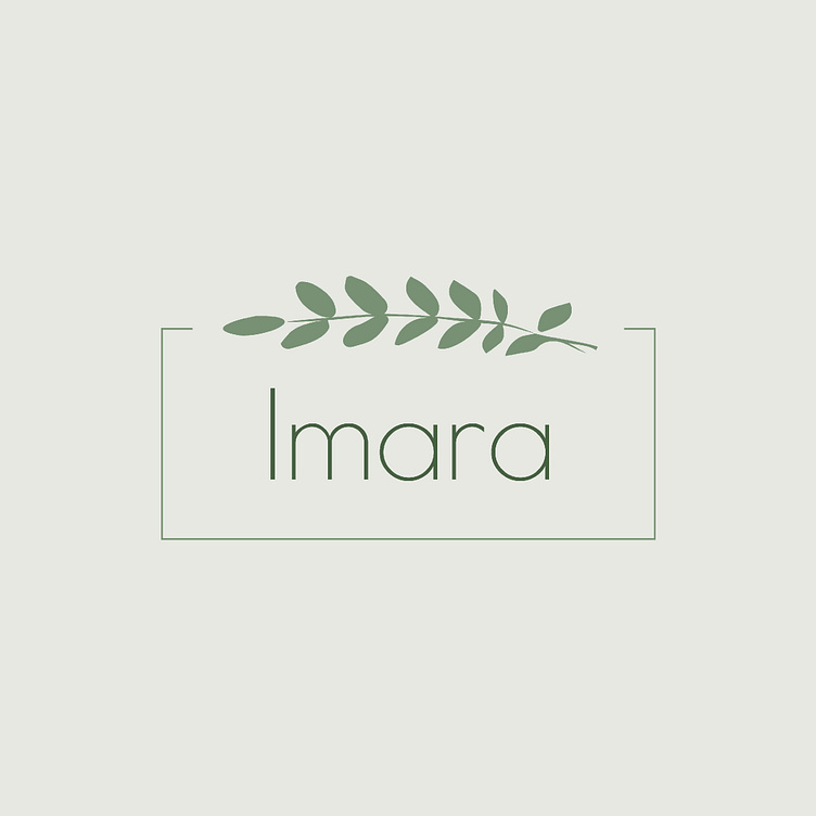
The leaves at the top relate to the leaves on the Acacia Tree in Africa, specifically Kenya. The box around the type and leaves defines the space. The leaf/leaves can be used as a submark in branding. An additional word: Imara. The new word is placed on the left side of Imara in light green lettering to not take away from the word most important word: Imara. ⠀⠀⠀ The typography is kept professional, minimal, clean, and legible. Designed to be easily printed onto materials as well as still be legible on those materials.
The green color palette relates to the tree: the earth, the leaves, nature. The sage green adds color but keeps the design soft and inviting. Sage gives a sense of relaxation and cleanliness. Being a skincare team, it was important to use colors that emulate the brand's purpose of natural, healthy skincare. ⠀⠀ There are three different green tones. Incorporating each adds dimension while expressing the order of importance. The dark green on "Imara" helps make the name stand out more than the design. It is the most important part of the logo: the name. The next color in the pyramid is the sage green that is used for the supporting design elements: box & leaf. These are secondary to the importance and help bring the design together. The last color is light green. The company Team Imara is a part of is important but not the most important part of this team logo.
