Holy Week Facebook
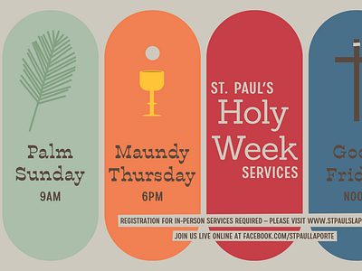
I was asked to do a grid design. Each section was represent the different part of Holy Week. I reused the fonts from other church projects but tried different weights to give a slightly different feel.
In digital designs I can go with colors. I am thinking of reusing these colors in the future. The round corners make reference to my various other church projects.
The colors and mini illustrations were also used to create banners for Google Form to sign-up for services (social distancing).
More by Mike Konieczny View profile
Like
