Coffeeshop Logo Marks
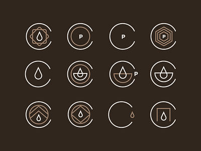


This is a coffeeshop concept I worked on. I wanted to show just how many marks happen when I create a new logo. A LOT! I came with a lot of them before I ultimately went with the circle diamond inside of the C. The concept of the coffee shop (changed the name for this) was a space that was created out of shipping crates. I knew there should be some geometric element that enclosed the coffee drip. I also love logos that are modular and can be taken apart to make different sized logos for different purposes (final slide).
