Kirsten Gord logo

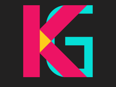
I tried several different fonts and ended up with these two as they overlapped really well. I love how the "K" overlapping the "G" creates another triangle.
I tried several different fonts and ended up with these two as they overlapped really well. I love how the "K" overlapping the "G" creates another triangle.