Your Counselling Matters
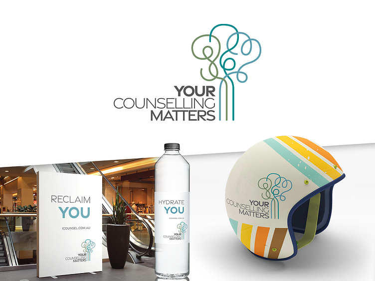
I started to explore the concept of therapy being the conduit to unravel those tightly woven threads to create order from chaos. This concept has many layers, but this is the primary emotion it tries to visualize.
While the brand works well in monotone, the colours in the primary brand lean masculine while remaining non-aggressive, and appealing to everyone. The overall shape is unique and non-corporate too which should help give an instant break from a lot of the “clip-art” logos you see in this field.
This brand has many layers and connections; 1. The tree representing strength, wisdom, and stability. 2. The progression from tangled emotions to a straight path. 3. Subtley, given that a large focus is on marriages, the 3 cords represent the 3 cords from Ecc. 4:12 “A cord of three strands is not easily broken.” 4. The tree is meant to slightly resemble a brain. 5. The branches spell out YCM