ShiftNudge / Style
Design Direction
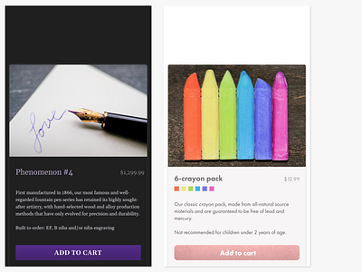
Serif fonts and purple-on-dark presentatino always give me a slightly more serious feeling, hence the usage in fountain pen prodcuct card.
While I did consider using Comic Sans for the crayon card, it's too... cliché. Futura is a good alternative here.
Images from https://unsplash.com/photos/BMgpSv9mtpc and https://unsplash.com/photos/IcT8l8DDek8