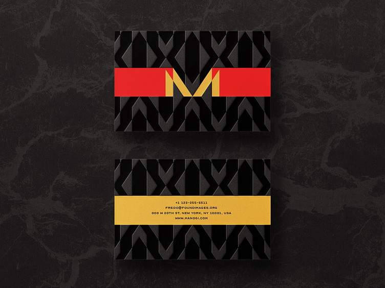
M Lettermark Fashion Business Card
Manogi rejected concept from a previews project.
This one was fancy anyways, I loved it. It’s super highly fashionable and complements the brief.
The objective was to create an elegant identity for a home scheme diffuser business that makes high end/ premium products.
Manogi is a word in Maori inspired from the New Zealand culture.
And the objective was to create an identity that compliments the Maoris culture and style.
Their clothing contains a lot of geometrical elements especially triangles that work in isometric grids.
The stile direction was fixated to a more minimalist, luxurious theme that includes sharper edges, triangles thin letter and simplicity.