Strategies 2.0 (for SDSU) Branding


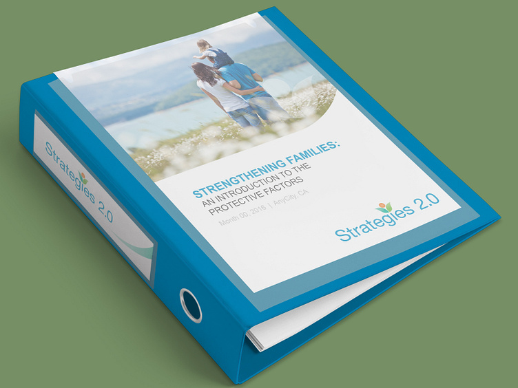


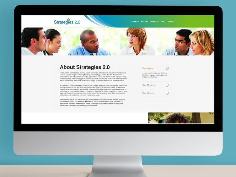


This branding campaign was for a training program for social worker professionals through San Diego State University, called Strategies 2.0 - a community-driven commitment to strengthen children and families through a lens of equity and inclusion. It included a logo, powerpoint template, binder materials, lots of templates for inserts and supportive graphics for the website (which has been changed since I worked on this - I don't know why). The orange circle in the logo represents the child, and the two leaves represent the social worker and parents.
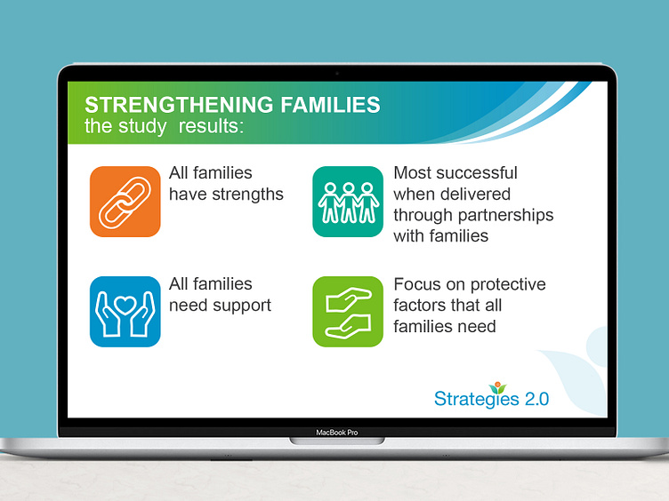
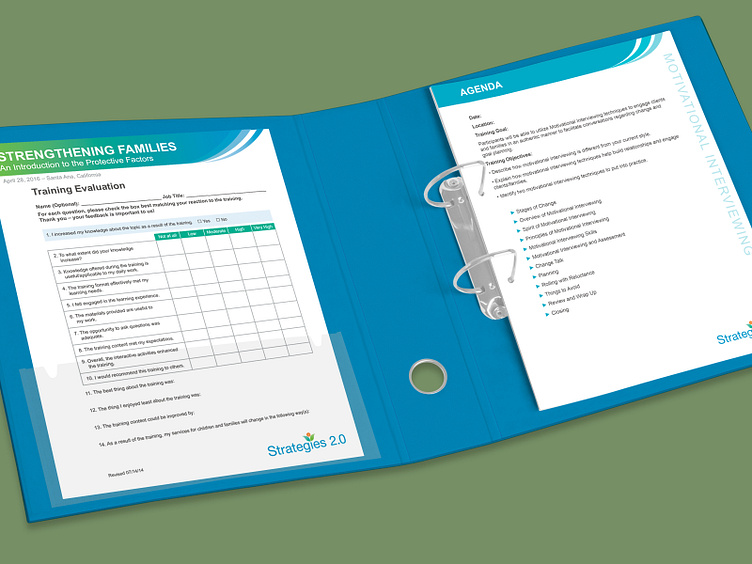
This branding campaign was for a training program for social worker professionals through San Diego State University, called Strategies 2.0 - a community-driven commitment to strengthen children and families through a lens of equity and inclusion. It included a logo, powerpoint template, binder materials, lots of templates for inserts and supportive graphics for the website (which has been changed since I worked on this - I don't know why). The orange circle in the logo represents the child, and the two leaves represent the social worker and parents.
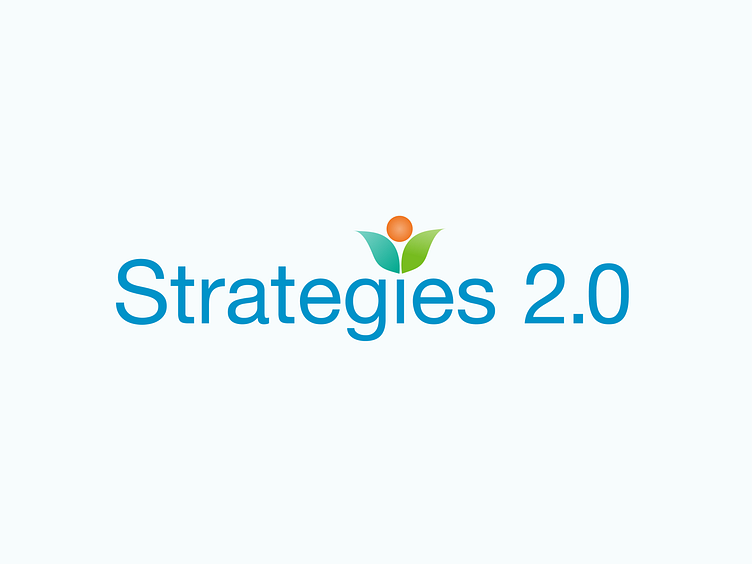
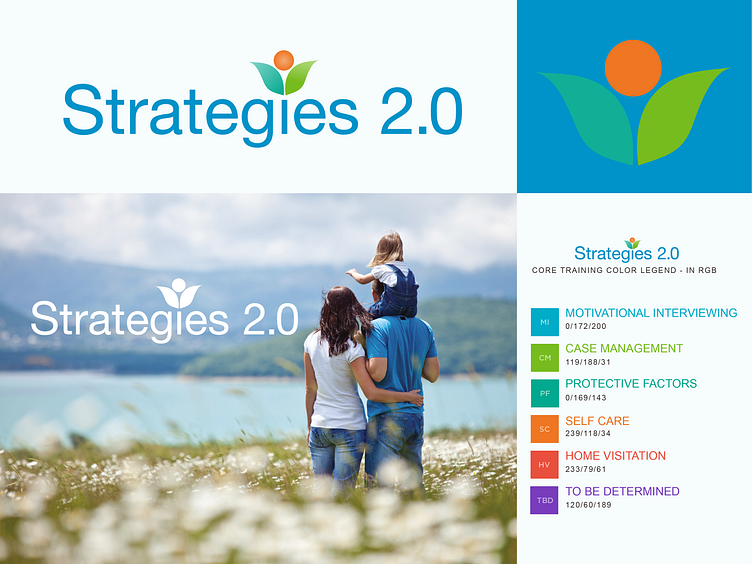
This branding campaign was for a training program for social worker professionals through San Diego State University, called Strategies 2.0 - a community-driven commitment to strengthen children and families through a lens of equity and inclusion. It included a logo, powerpoint template, binder materials, lots of templates for inserts and supportive graphics for the website (which has been changed since I worked on this - I don't know why). The orange circle in the logo represents the child, and the two leaves represent the social worker and parents.
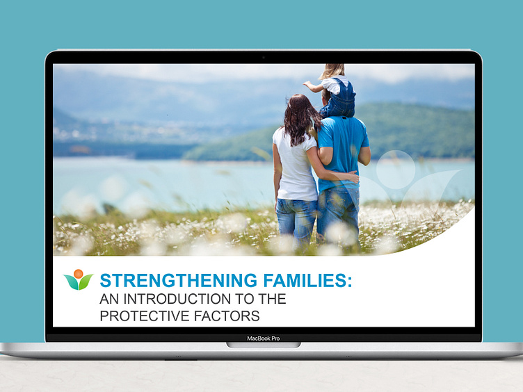
This branding campaign was for a training program for social worker professionals through San Diego State University, called Strategies 2.0 - a community-driven commitment to strengthen children and families through a lens of equity and inclusion. It included a logo, powerpoint template, binder materials, lots of templates for inserts and supportive graphics for the website (which has been changed since I worked on this - I don't know why). The orange circle in the logo represents the child, and the two leaves represent the social worker and parents.
This branding campaign was for a training program for social worker professionals through San Diego State University, called Strategies 2.0 - a community-driven commitment to strengthen children and families through a lens of equity and inclusion. It included a logo, powerpoint template, binder materials, lots of templates for inserts and supportive graphics for the website (which has been changed since I worked on this - I don't know why). The orange circle in the logo represents the child, and the two leaves represent the social worker and parents.
This branding campaign was for a training program for social worker professionals through San Diego State University, called Strategies 2.0 - a community-driven commitment to strengthen children and families through a lens of equity and inclusion. It included a logo, powerpoint template, binder materials, lots of templates for inserts and supportive graphics for the website (which has been changed since I worked on this - I don't know why). The orange circle in the logo represents the child, and the two leaves represent the social worker and parents.
This branding campaign was for a training program for social worker professionals through San Diego State University, called Strategies 2.0 - a community-driven commitment to strengthen children and families through a lens of equity and inclusion. It included a logo, powerpoint template, binder materials, lots of templates for inserts and supportive graphics for the website (which has been changed since I worked on this - I don't know why). The orange circle in the logo represents the child, and the two leaves represent the social worker and parents.
