FysioVitalis - Logo Design 💪
FysioVitalis®️ - Logo Design v2✅
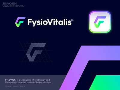
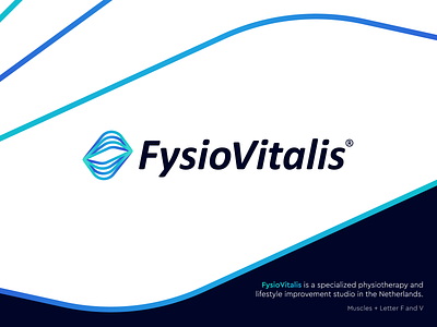
FysioVitalis is a specialized physiotherapy and lifestyle improvement studio in the Netherlands.
A little behind the concept:
As my precious (first) concept was a bit too much focusing on sharp letters, my aim for this concept was to make it feel more friendly and human.
I got inspired by the way muscles get stretched and how this comes back to FysioVitalis on a daily base, this was something worth including in their identity.
With not learning too heavy on the letters mainly, the letters V and F are more in 'the back' as this is just a side element which could potentially make the connection to the studio.
Still wanted to make an interesting and less flat visual which shows connection and weaving lines and human engagement.
Hit L to support this post so more can help in sharing feedback on this concept as the project is still ongoing.
Have you ever seen a similar mark? Do let me know so I know if proceeding this direction have enough potential.
Interested in working with me?
Let's make a mark, together!