Bank Clarity - Be the Bank. Be the Brand.
We are always excited when we can reveal a new brand project and BankClarity is no exception.
One of the most intriguing things about BankClarity's technology is its deep complexity which enables utter simplicity to its users and this was a key theme in our direction. The world of cross border transactions is a complex one, but an incredibly under-serviced one.
It is very easy to ideate with technology to create obvious problems to solve but we truly admire businesses that look at deeper and trickier problems to unravel and BankClarity do just that.
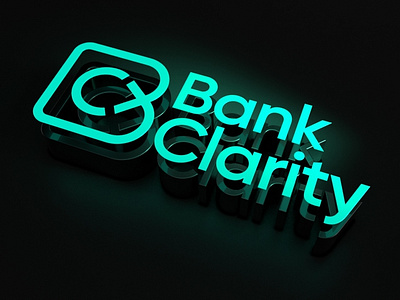
The logo marque presents the clear B and connected C, conveying harmony and flow of the payments process; the dark mode black with electric green provides a modern technology feel.
Their tone of voice is driven by Aidan McAvinue (CEO) who has dared to be different and recognised that sitting in a brand theme is not good enough anymore. In a sea of corporate ubiquity, being bold enough to find your voice was important here and it was made much easier with this collaboration.
We are incredibly excited to observe and contribute to the growth journey of this business...lots more to come.


