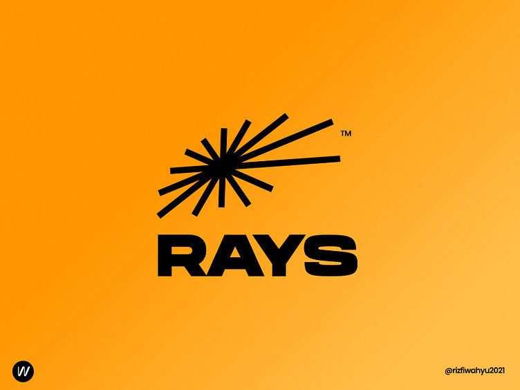
RAYS Logo Design
Hi everyone,
Solid, tough, genuine, abstract, and geometric are the pain points for this exploration logo.
Geometric lines arranged to sunrays form and shaped perspectively. By maintaining the simple geometric shapes give a modern and minimalist impression into the logo.
What do you think about it ? Please don't forget to press "L" for this design.
Do you have any trouble with your brand or your visual identities for your business ? Drop you inquiries on : wrizfi@gmail.com
More by Wahyu Rizfi View profile
Like
