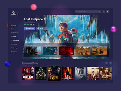
OTT Platform UI Design
OTT platform design is always a difficult task for a designer as it engages with all age groups of people and designers have to match the color phycology of all of them.
Here we have designed the app by keeping all small things in mind. The color combinations are a little different than the usual OTT platform which makes it more vibrant and unique. So it helps to attract more users to the application and boost your traffic.
Please go through the design and let us know your views on it by commenting!
Tools: Adobe XD
We’re available for new projects! Drop us a line at biz@cmarix.com or
https://www.cmarix.com/inquiry.html#utm_source=Dribbble
—
Press “L” and shower some love.
Want to see more projects? Visit our profile and remember to follow us!
Instagram | Behance | Uplabs
