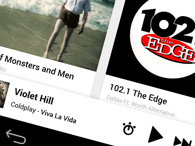
iHeart Radio Player
This is the player portion of the case study for the new iHeart Radio android app. The current app doesn't follow the guidelines Google put in play for application. First I wanted to flatten everything. They seem to have the attachment to skeumorphism that just wont go away. I removed all brushed metal and replaced them with native context menus for consistency. I also worked with the navigation a bit to create a sense of hierarchy (following the Android guidelines). The next set (when they are ready) will dive deeper into the the navigation in whole and also adding context menus much like the Google Music app. Let me know what you think and make sure you check out the attachment.
More by David Poninski View profile
Like

