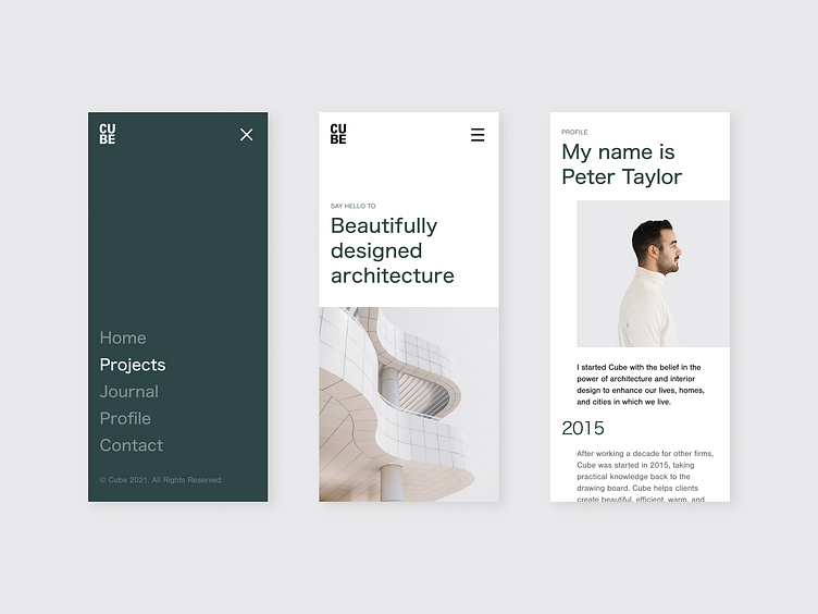
Cube Studio – Web Concept
Hello there!
Today I want to show you the shot I’ve made recently. It’s a mobile website of an architecture studio called Cube. I wanted to keep it as clean as possible and use a beautiful combination of greenish dark turquoise and broken white. I really hope you like it :)
More by SwingDev View profile
Like
