Antiblanqueo: Data Analysis Option Display
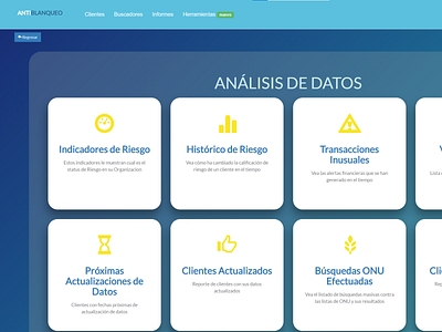
Decided to use big and bold buttons too open up the view of a mundane report picker. The rounded corners and the transparent base for the buttons was added to give depth to the menu elements and to give assurance to the user that each whole white panel was a button they could press anywhere and not miss the command. Also the color palette gives visual harmony to the section and the yellow icons pop out and give a hint of contrast to rest of the color pallette
