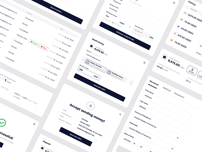
Cryptocoin system elements
😎Here you can see pop-ups, tables, and some system elements on the shot.
🔳We used black and white colors because we wanted to concentrate the user's attention on the data in the interface. So that the whole focus is on the transaction process. We also used complementary colors with the help of color coding, we emphasize whether the transaction was successful or not.
❤️Share your thoughts in the comments section or press L to like!
👀 Make sure to subscribe to our social media:
Instagram | Behance | LinkedIn | Facebook
🖖You're welcome. We’re available for new projects! Drop us a line at hello@equal.design
More by Equal View profile
Like

