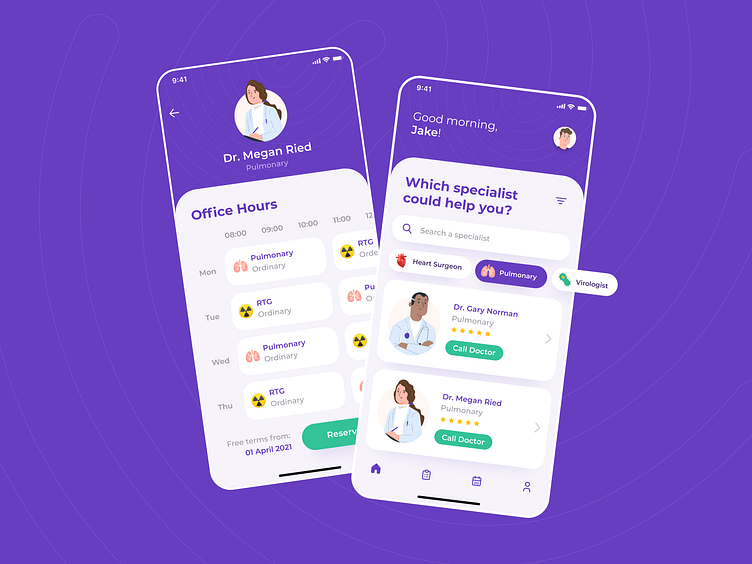
Healt App - Doctors and their office hours
Hi all designers! 👋
Recently I've designed Office Hours for doctors app. It was quite challenging because I didn´t know exactly how the office hours of pulmonary works.
Quite a challenging was also the bottom part with reserve button, where I was hesitating about text alignment and finally decided to right align because of better readibility and closeness to button.
The rectangles with description (Pulmonary or RTG) are without shadow because these are not interactive elements.
Hope this shot will be inspiring for you.
💌 I am open to new projects! dominikasnejdrova@gmail.com
Want to learn something new? Have a look at my What I´ve learned from copying design series here: https://www.instagram.com/design_dominika/
My complete design portfolio: https://www.behance.net/dominikasnejdrova
