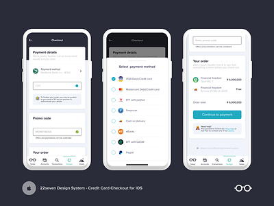
Credit Card Checkout for the iOS App - Daily UI challenge #002
Hey Dribbblers 👋 welcome to day two of the challenge!
What are we seeing here today?
To test the robustness of our new design system, we have decided to use the new assets we have created for 22seven and apply them to the 100 day DailyUI challenge.
Today's challenge was a credit card checkout page, something that doesn’t currently exist in any of the 22seven apps.
It’s been a while since I put an e-commerce hat on, and I must say I enjoyed stepping out of my comfort zone for a bit. If you have some pointers for me to improve this design I would love to hear them!
Note: As we do the design challenges I will specify whether the shot design is an existing feature in our app or if we created a custom design to fit the brief of the DailyUI challenge. We are doing this to showcase our design system capabilities/flexibility on Dribbble but we don't always have the features to apply the challenges to so we make them up as we go along.
Looking forward to hearing your feedback, which is always welcome and appreciated 💗
Mila & Team Atom
