Business Cards Design
The brand identity that got based on illustrations
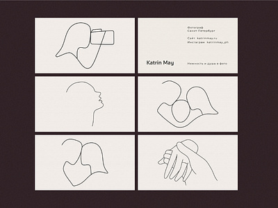
Katrin May is a photographer’s project that has its own values.
Thus, the illustrations have become practical for usage as well as mindful in terms of visual communication.
They intended to brand the photoshoots' types, although, they might also be used as the logotypes. Thin lines are not getting most of the attention, but act as an orientation point for the client when choosing a service, thereby unintentionally getting remembered. The smooth curves reflect the brand's politeness and the idea of tenderness, while the overall minimalist design supports its efficiency and reliability.
Need a branding?
Text us: contact@katezest.com
