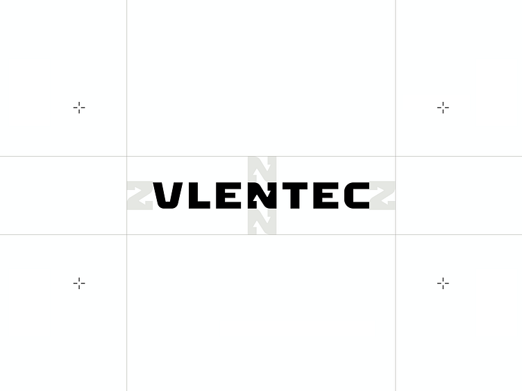
Vlentec


As experts in the field, Vlentec know a thing or two when it comes to exceptional vacuum lift engineering. All they needed to elevate their business to the next level was a brand and online presence capable of some heavy lifting.
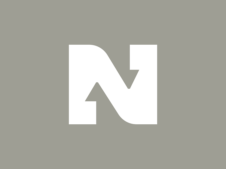
The letter "N" in the logo contains two visual elements. The two ends can be seen as two tensed bicep muscles, reflecting the strength that the machines of Vlentec have. In addition, two arrows can be found in the negative space, which stand for the up and down movements of the lifting machines.
As experts in the field, Vlentec know a thing or two when it comes to exceptional vacuum lift engineering. All they needed to elevate their business to the next level was a brand and online presence capable of some heavy lifting.
The letter "N" in the logo contains two visual elements. The two ends can be seen as two tensed bicep muscles, reflecting the strength that the machines of Vlentec have. In addition, two arrows can be found in the negative space, which stand for the up and down movements of the lifting machines.