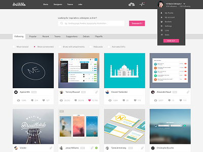
Dribbble Redesign - Home
I often use Dribbble and I thought a slight redesign, unpretentious..
- Boostrap 1170px grid with 30px gutter
- Research is simplified with filters to sort the shots without having to go to another page.
- In the grid, the popular post are highlighted.
I don't want to imagine the best dribbble or a very new design, i don't have this pretentious... I just want to respect the brand colors and content to propose a light facelift!
I also work the other pages to show you soon my vision... Feel free to comment and tell me if something seems inconsistent!
More by Marie Dehayes View profile
Like

